Devlog: How we made a huge animated fantasy city map!
Preface
At the time when our team were working on this task, we faced many problems including lack of information, lack of references and inexperience in this aspect of development. There are other, maybe more more professional ways to complete such a daunting task.
References
We looked for examples from other games - how they did it and how close it was to what we wanted. We looked at many point-and-click games, adventure games and even strategies, asked friends and colleagues about the best point-and-click maps. But we could not find a map that would satisfy our request for visual performance, so we had to act on our own.
We decided to create the base of the map in 3D to use it in further locations with an ideal perspective angle (This is very important for environmental artists). This helped us get a unique visual style.
We started with a top-down sketch.
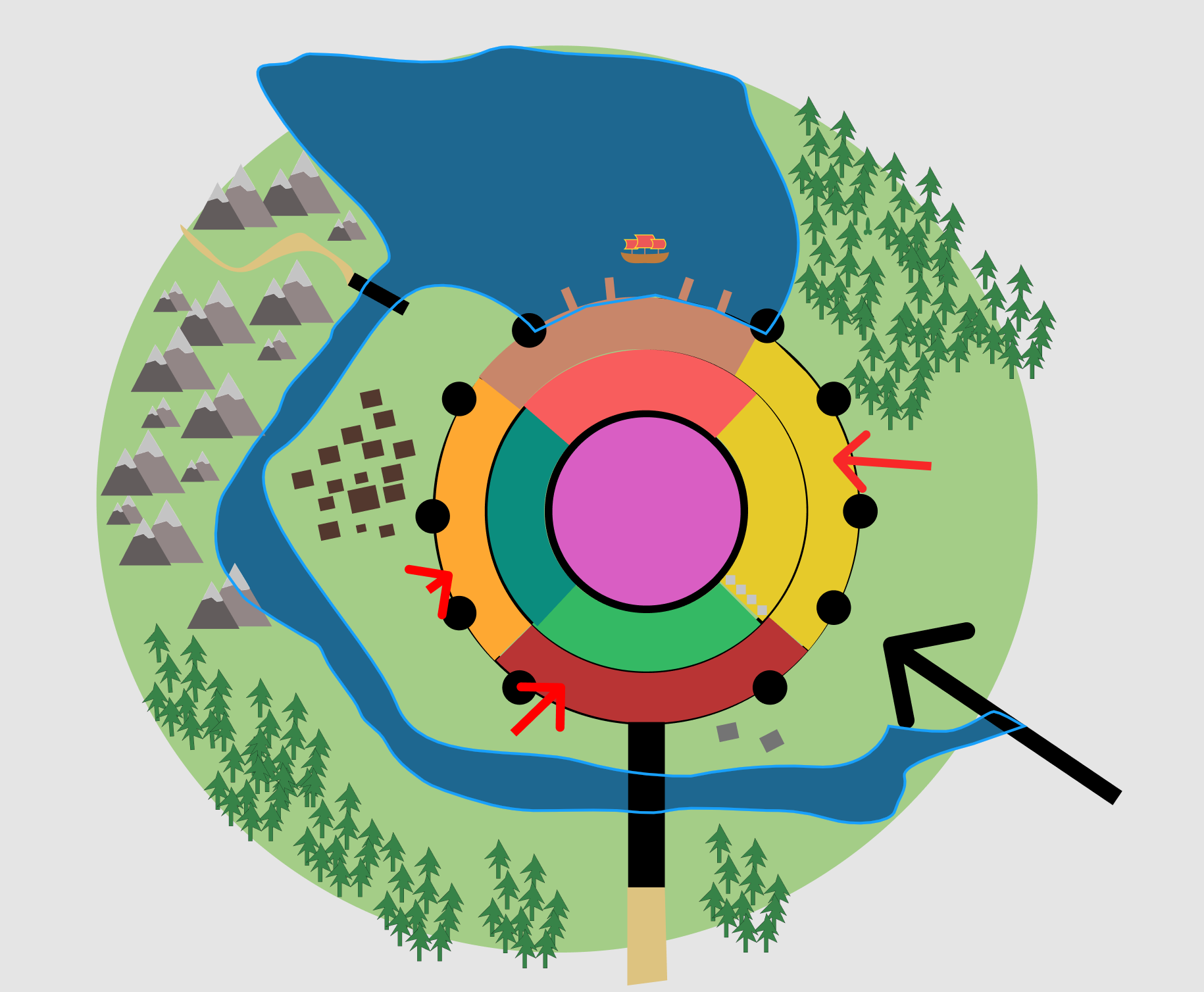
This is what we did at the very beginning, painted in Figma as we see it ourselves. We then moved on, making better quality sketches.
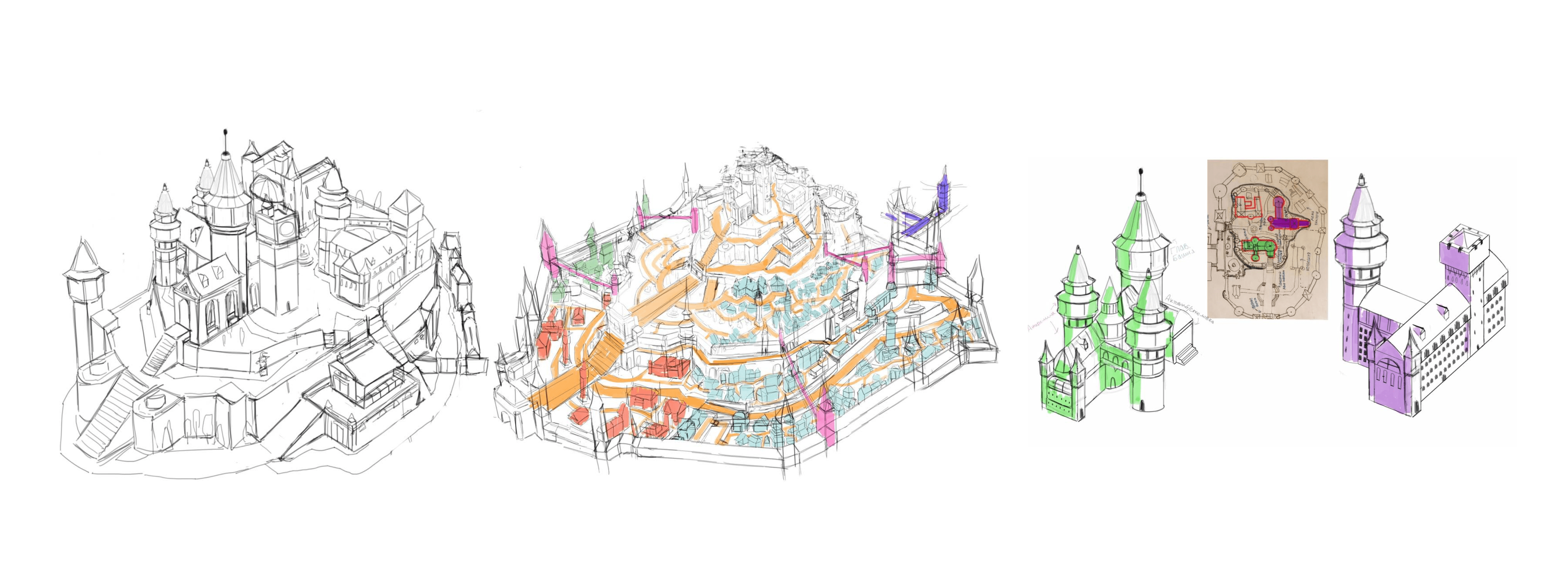
Then the question arose about choosing a 3D package.
The choice was between SketchUp and Cinema4D. Unreal Engine was also an interesting option, but we didn't have much experience dealing with it.
We decided to try SketchUp, as it seemed the easiest to learn and use.
Our first attempts at SketchUp looked like this:
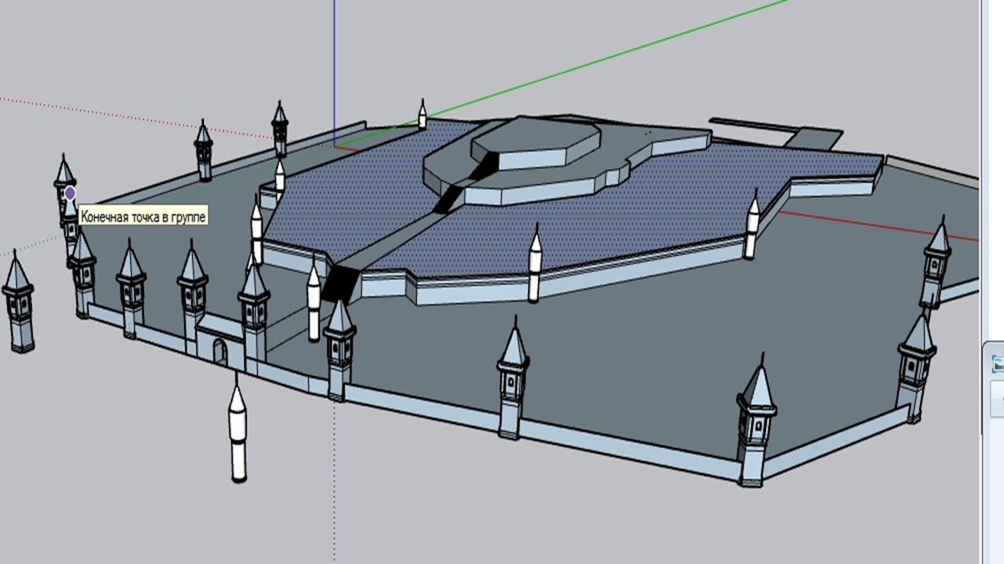
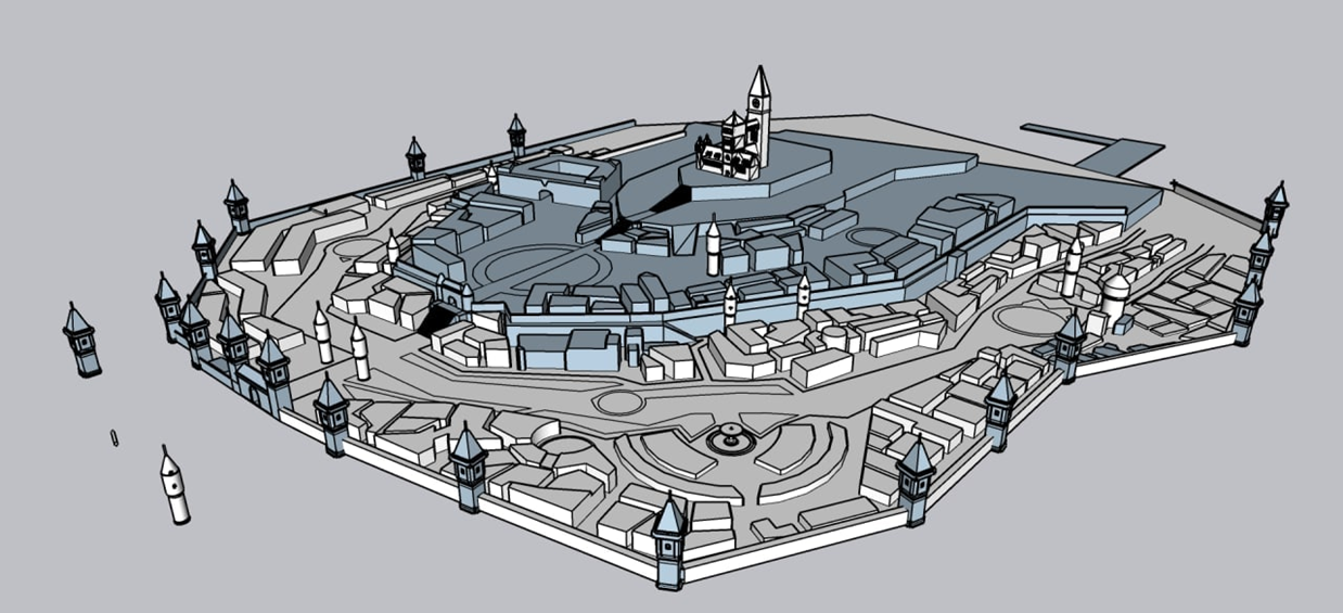
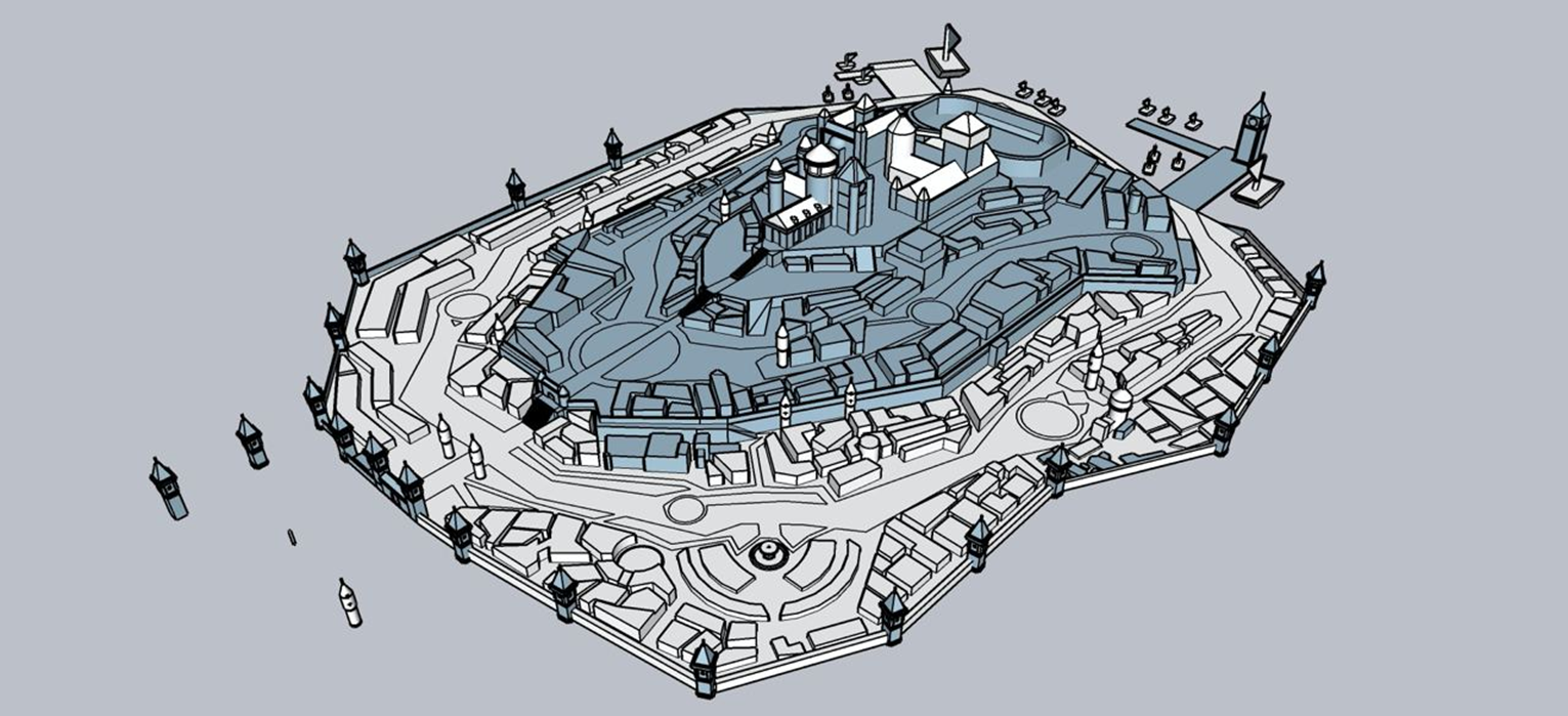
The model above took two weeks of work and was done by two people. This was their first experience in 3D modeling.
It was a very trying time for the team. Our first build was on the way, and the the map feature should have been already implemented in the first build, but we didn't have time to do so. The complete lack of understanding of how it should look led to the question "Is modeling it worth at all? Isn't it easier to just draw it?"
Although SketchUp is good for sketching backgrounds and setting up a base before painting, it didn’t fit our task of creating a great fantasy city. As you probably understand, we did not give up on it and started looking at other approaches. Next approach was Cinema4D, for which we called one of our friends who started working on the map.
We asked our very close friends from my last wish, namely my bro MASSOBLIVION, to help with the map. He helped us create the terrain of the map.
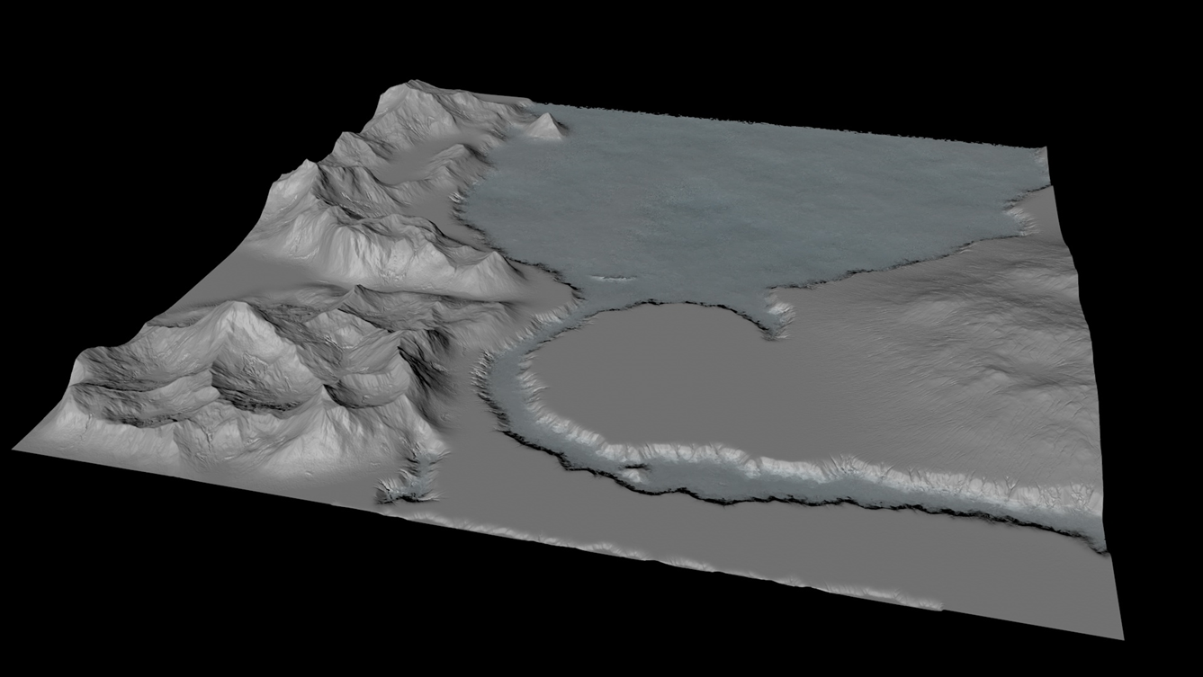
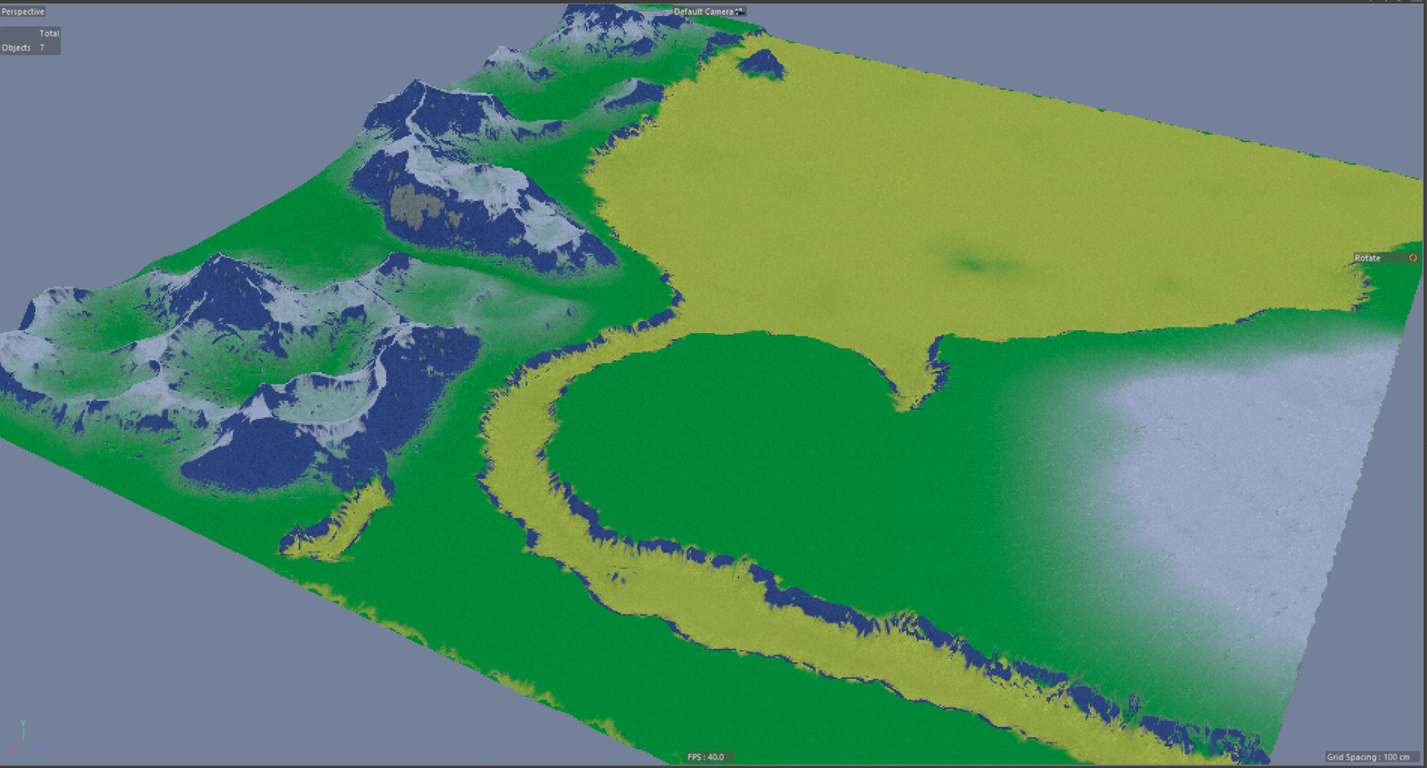
Our next model was made in Houdini.
We were still far from the final look. We still had dozens of hours of work to do. Even though we thought there was only a day of work left. How wrong we were...
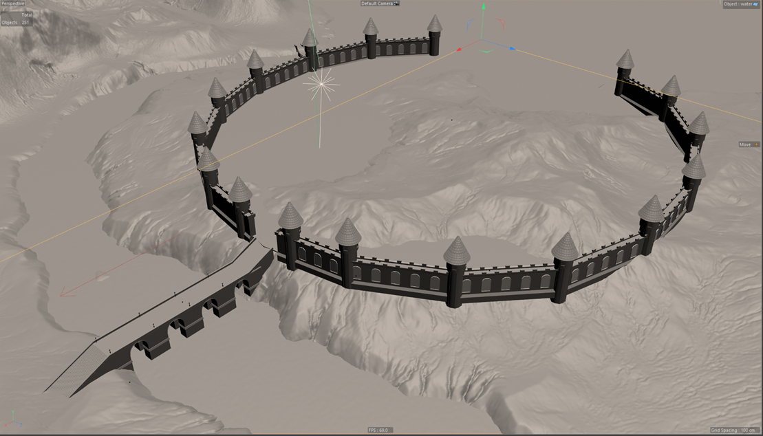
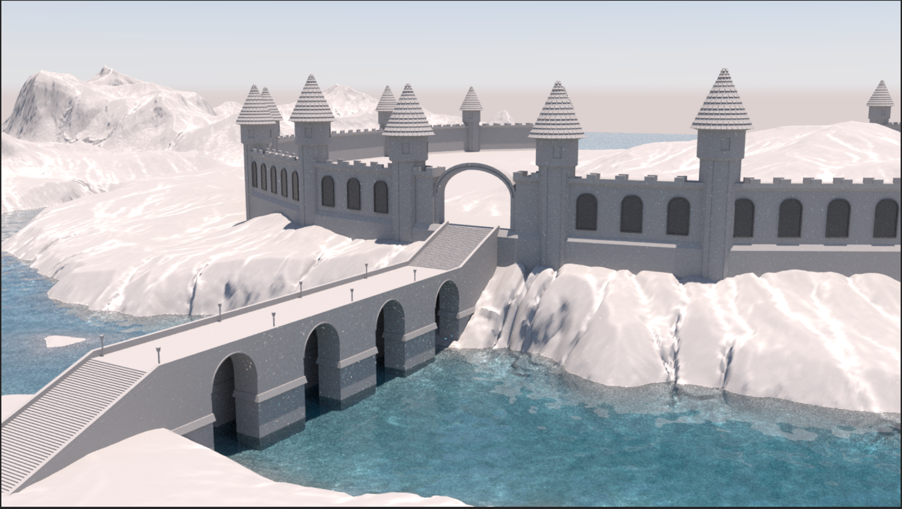
The towers in this form look different now, but the bridge remained the same. Below is our result after 1 day of work. We have created walls with towers, a bridge, and a water texture that will be changed further down the line.
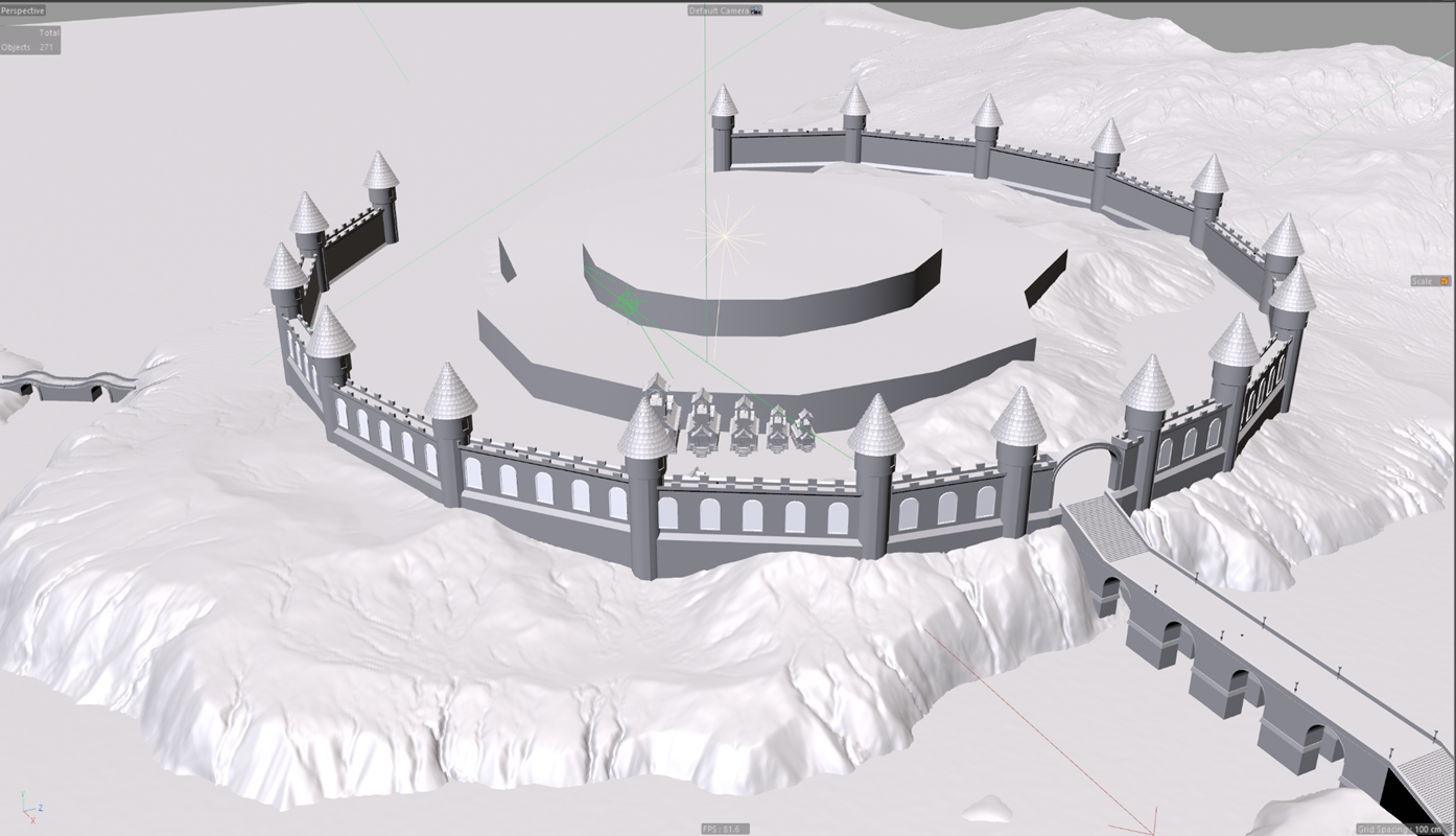
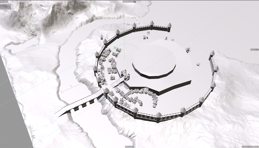
For the city buildings, we used assets to reduce development time.
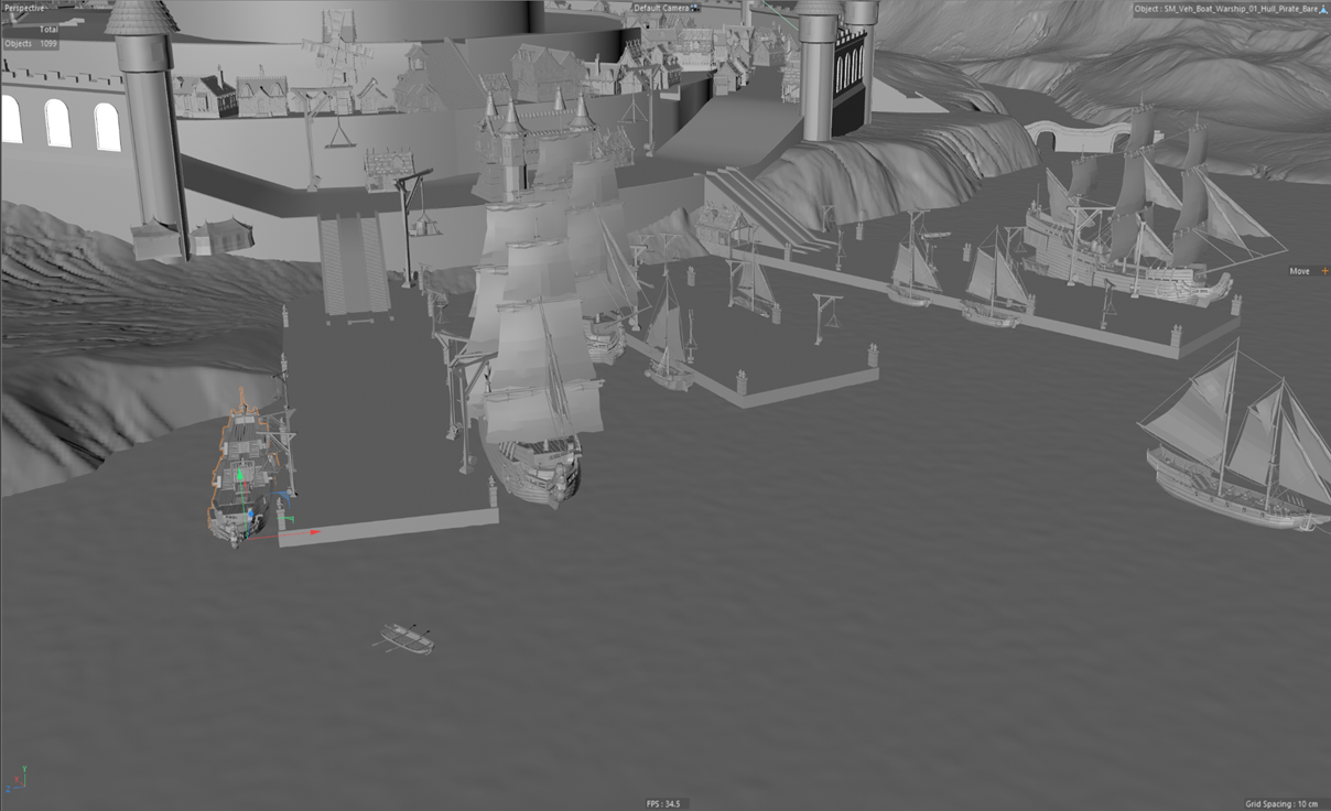
We were building the port and were glad that the map began to look better and cleaner.
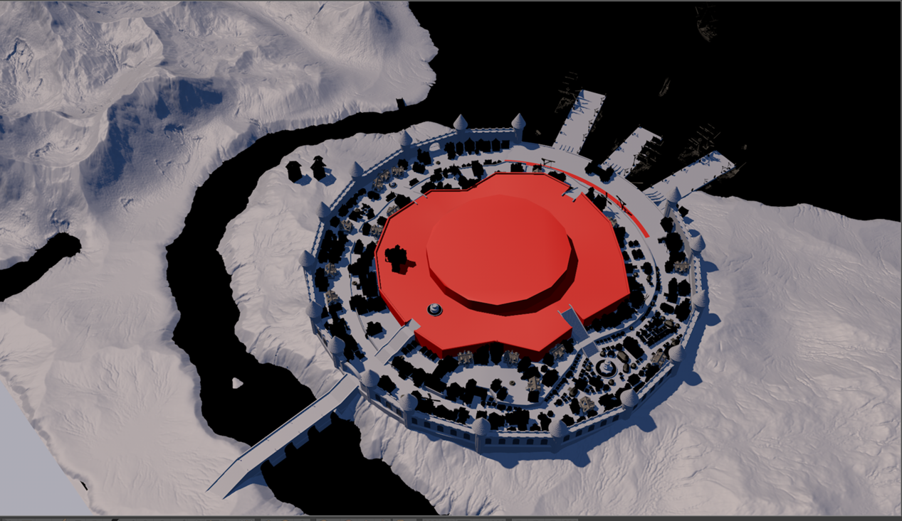
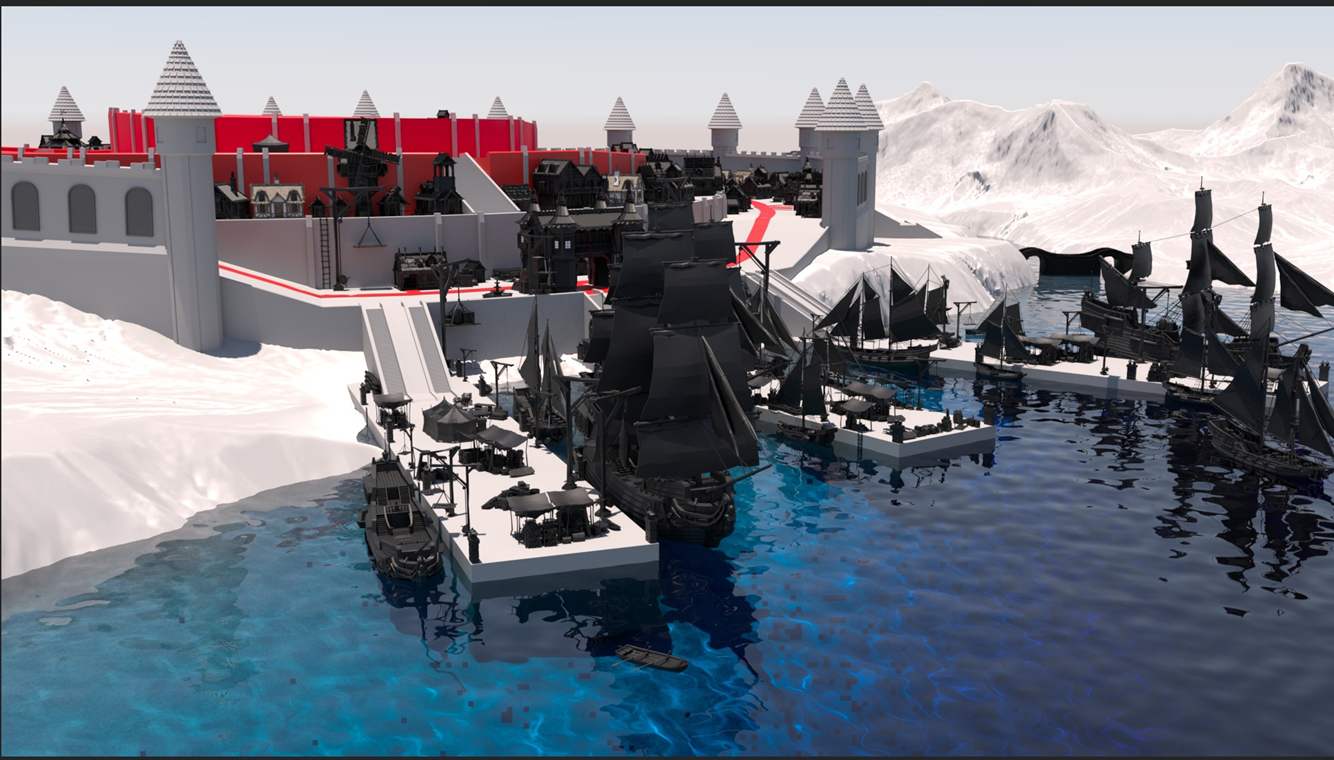
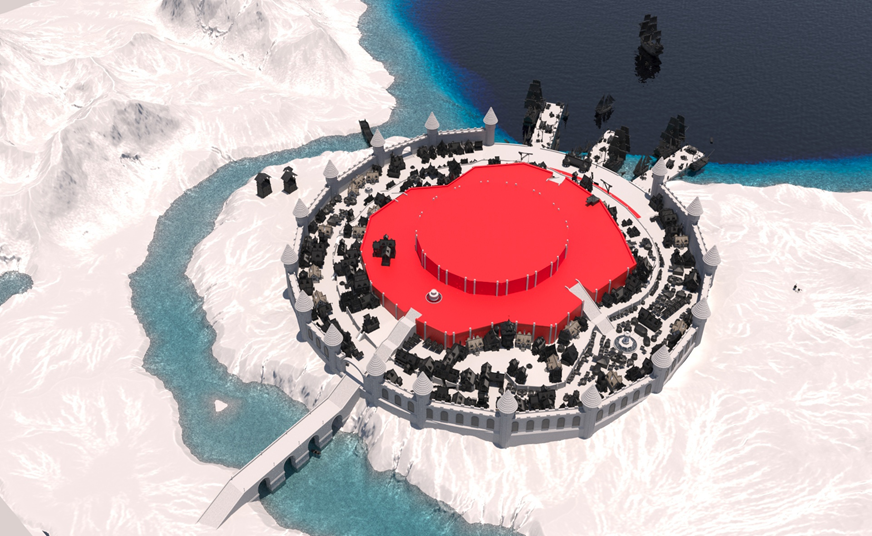
We wanted to give the artist painting the map as many textures as possible so that he would have to paint less. That's why we painted textures.
It was difficult working with the features of the terrain, since the map would always be visible from above. It was difficult to get rid of the tiling and we thought that we would hide it behind the grass, but even 1 billion grass polygons were not enough for us to cover all the fields.
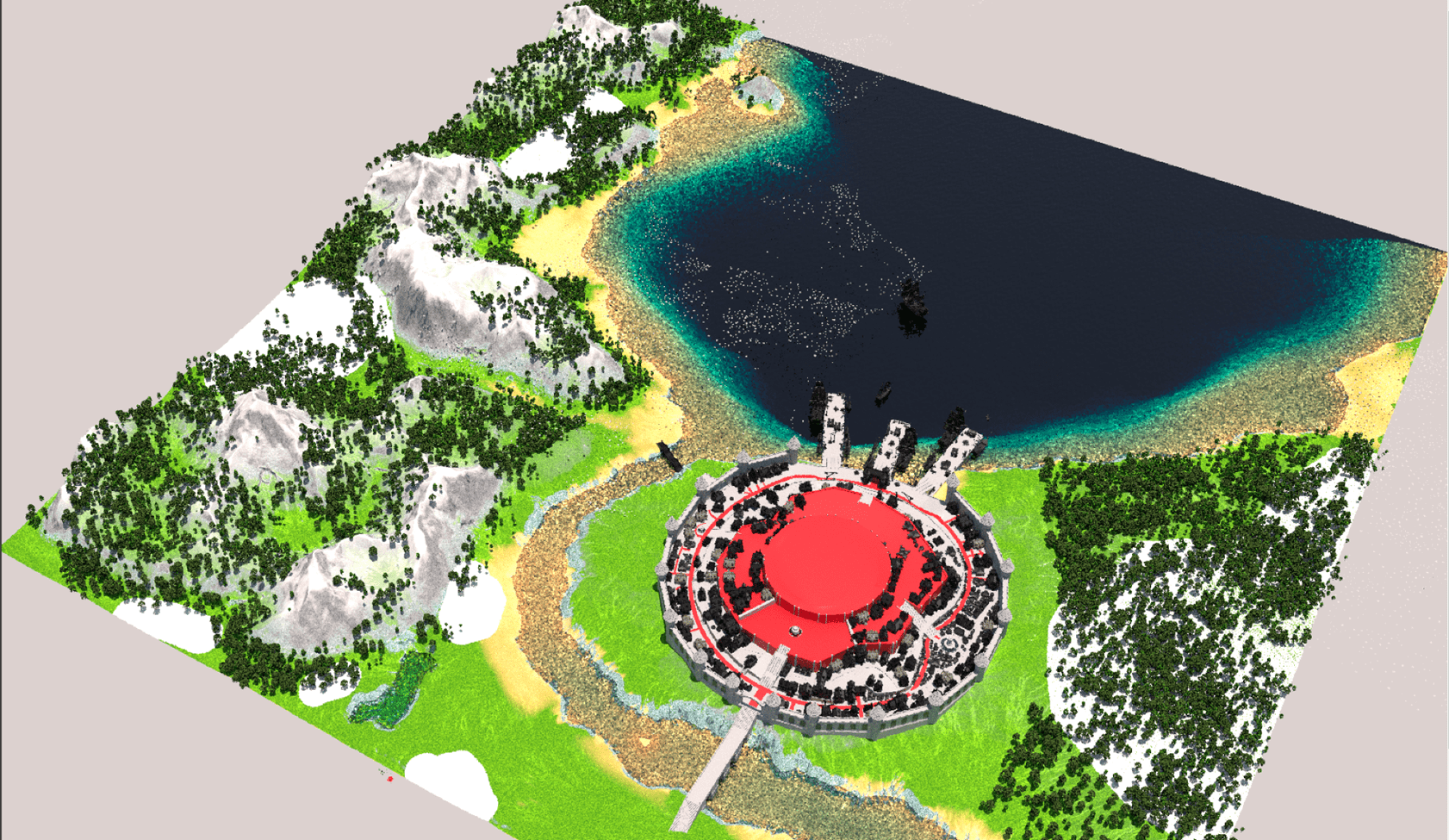
In the meantime, Cinema4D couldn’t handle the amount of polygons on the stage and even completely crashed the project without saving once. By that time we had been working on the map for about a month. But, fortunately, backup models saved us. The average FPS when working on the map did not rise above 20, and this is at 8 gigabytes of video memory. At that moment, we realized that we were nearing the limit of performance, although the map was only half ready. We were very afraid that in the end the result that we will get simply will not justify itself.
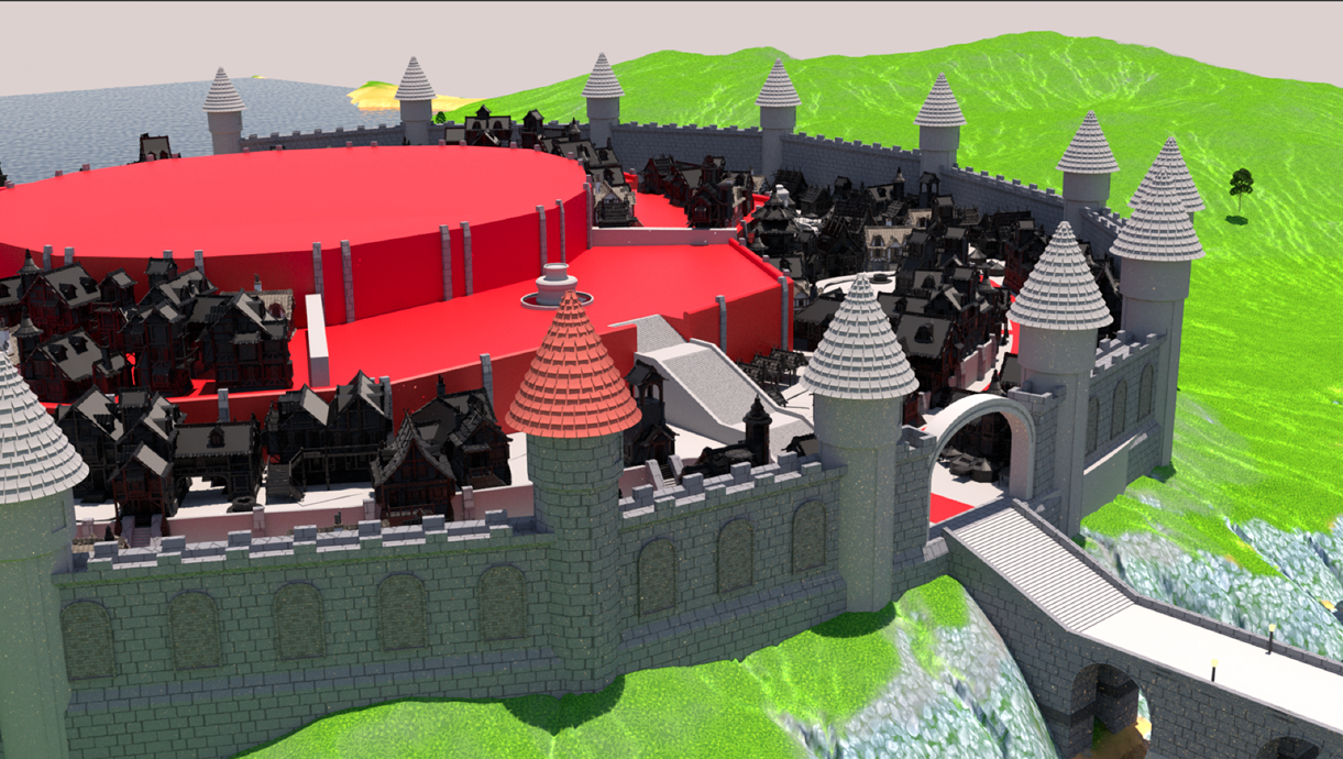
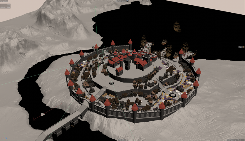
Here we have already started creating the academy, but we were not satisfied with how it looked, it didn’t look that good. The problem was that the buildings were separate and the height was the same.
We went back to sketch.
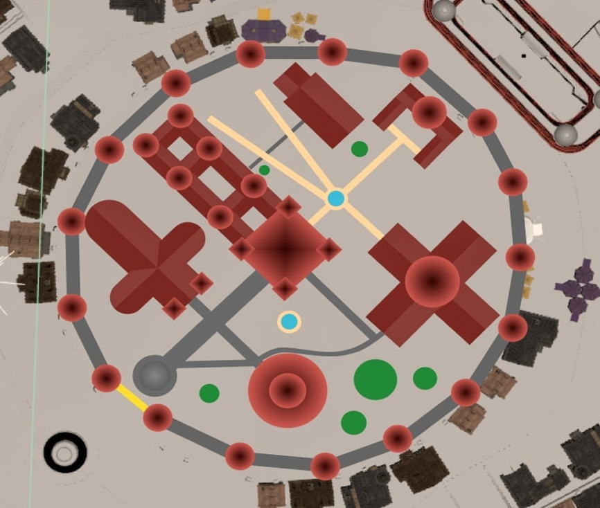
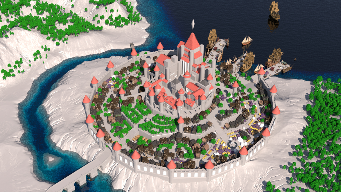
As a result, our castle turned into something like the photo above. We realized that we were on the right track, but the castle still did not suit our vision. The buildings were already fused together and it became impossible to make locations apart from each other.
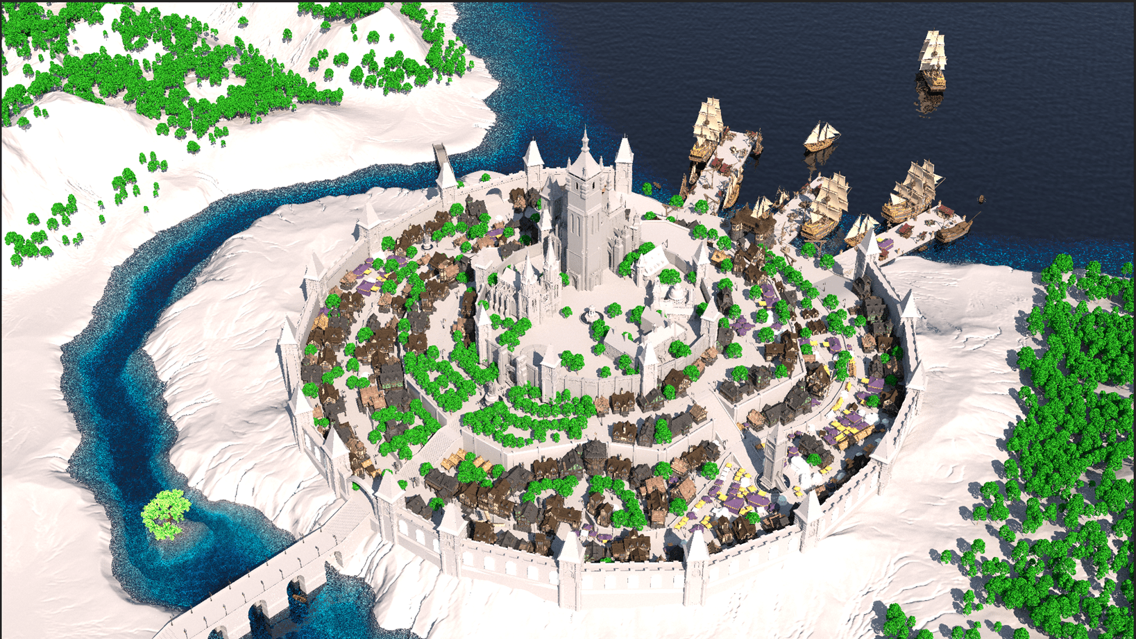
This is the final version of our castle in 3D. We were completely satisfied with how it looked. At that moment, the development of this 3D environment took over a month. If we count the time spent before Cinema4D, then, in total, it took about 2 months.
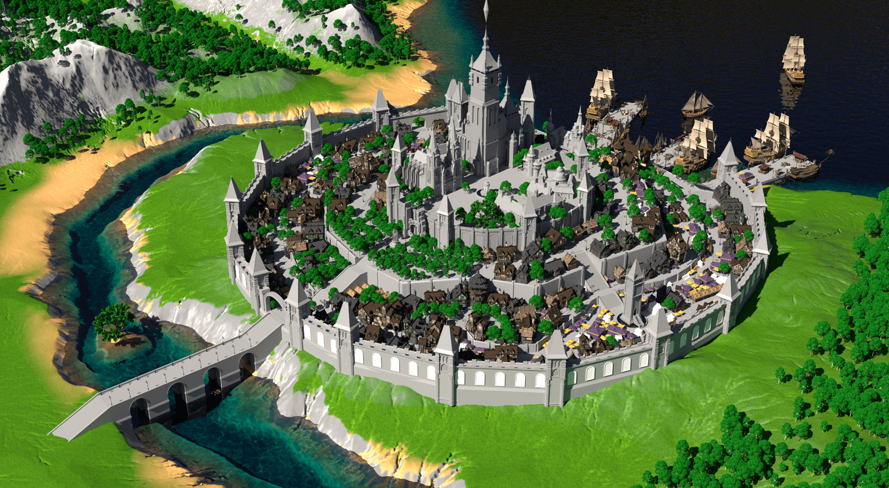
This is our final render. There was still a lot of work left, this time for the artist.
We gave the artist a completely disassembled map in the form of masks and channels in 4k resolution.
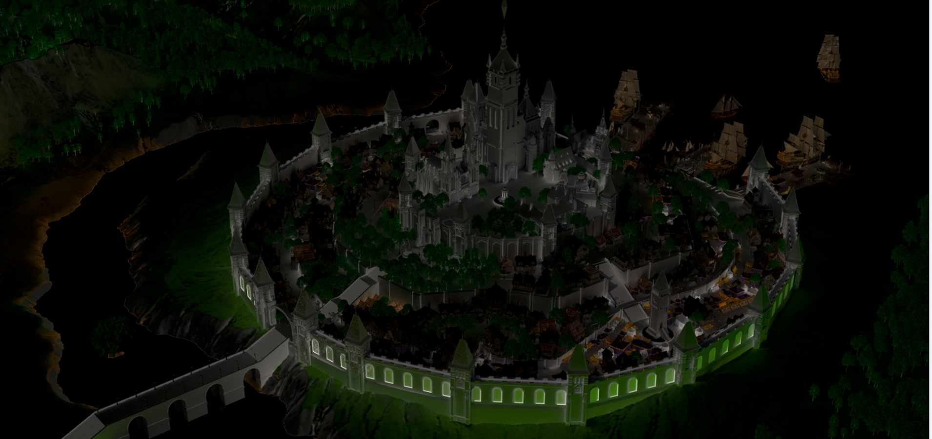
Artist stage
The artist had a very difficult job, and it was his first time making a painting at this scale. Using the 3D model as the basis for the drawing was an experiment. With each iteration, the map got better and better. The detailing work reached a level where benches, stone tiles and even bushes were easily visible. Algae, foam from sailing ships and caustic effect appeared in the water.
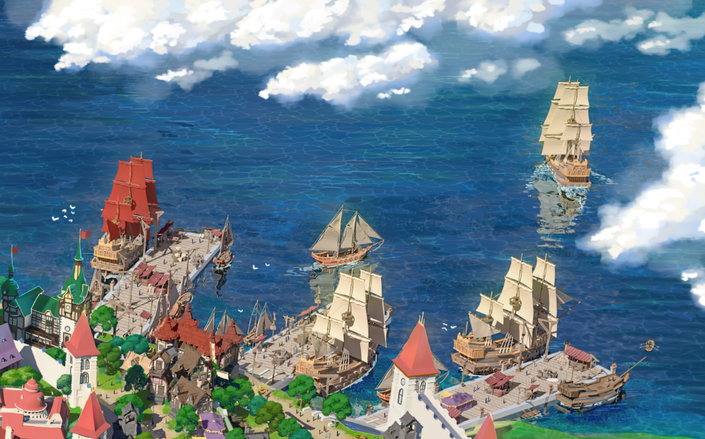
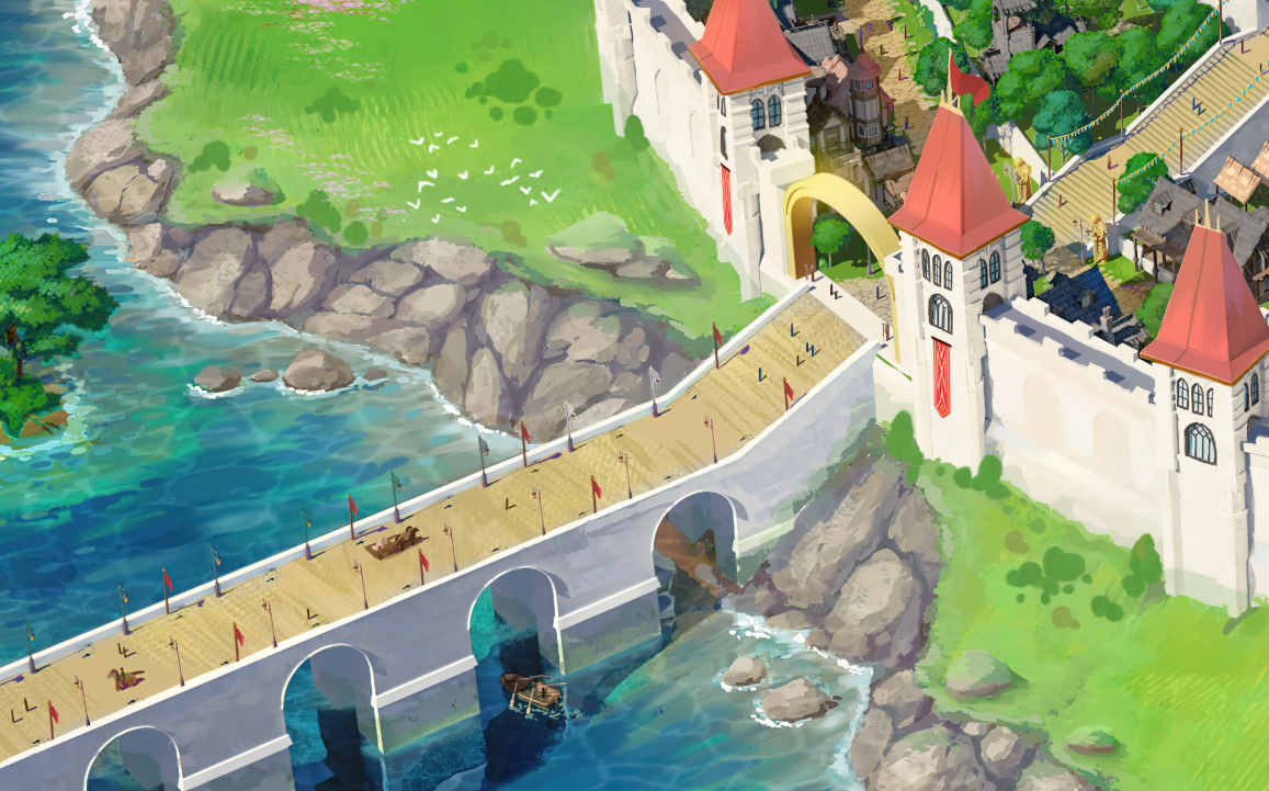
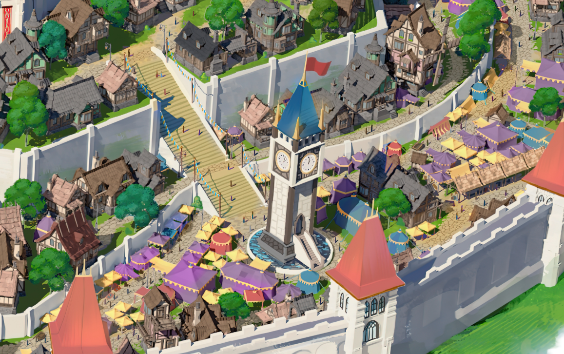
Thanks to the mixing of 3d and 2d, we got a mesmerizing result.
This is not all we did to improve the map.
We could not afford to end only on this, our goal is the best result that can be obtained, so we used neural networks to increase the image quality to 16k.
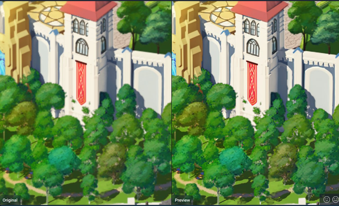
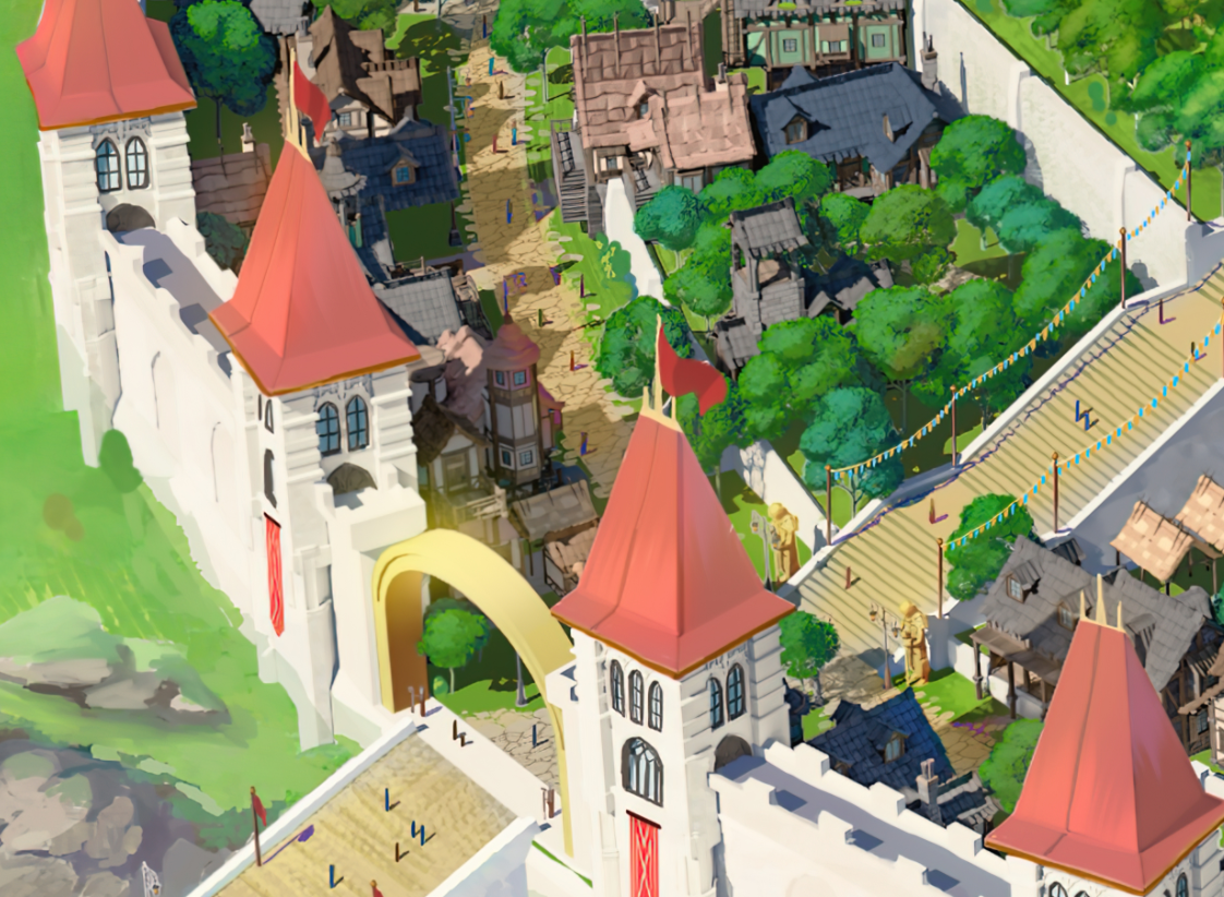
(Zoom 1000%) Now on our map you can easily see what may be happening in the windows)
Animation Stage
The next stage that awaits us is fully animating the map - marking movement of the wind, flags waving, lights flickering in the windows, movement of people and ships.
If you have any questions please write to us in the discord.
Files
Get WANDERER: Broken Bed | v0.9 - CHRISMAS GIFT (OLD VERSION)
WANDERER: Broken Bed | v0.9 - CHRISMAS GIFT (OLD VERSION)
Adventure with RPG elements
| Status | In development |
| Author | TOPHOUSE |
| Genre | Adventure, Visual Novel |
| Tags | 2D, Adult, Anime, Dating Sim, Erotic, Hentai, NSFW, Romance, Singleplayer |
| Languages | English, Russian |
| Accessibility | Subtitles |
More posts
- RELEASE - NEW Build v0.12 WitchCraft 🔮63 days ago
- Awaken: Hentai Dice DEMO - We'll see it on Steam very soon 🔥73 days ago
- Lyndaria: Lust Adventure - RELEASE ON STEAM 👙92 days ago
- Special Artbook Pack - 5 games at once - Check out our Patreon!95 days ago
- WANDERER REMASTERED - SPECIAL FREE BUILD v0.11.777 - A Fresh Look97 days ago
- Join our Telegram channel 💖Sep 11, 2024
- Check out the New Build of our friends! Umbranomicon v1.1.0Sep 08, 2024
- AURA: Horny Madness IS NOW ON STEAM + Patch v1.6 with Raccoon-Trader 😱 💥...Sep 06, 2024
- Devlog WANDERER “Witchcraft”🔮Sep 04, 2024

Comments
Log in with itch.io to leave a comment.
That looks super cool! I just tried out the game last night and you got me hooked. Wanna see where it goes and following closely!
The dedication to this idea made it into the game, and this is just insane... Give us more posts like this!
Jesus, It's impressive
I had no idea it was such a hard and painstaking job. Please make more posts like this
WOW!! That is amzing! You've done a great job, guys!