The Academy's new look
Hello everyone! Our Academy is gradually changing its image! Soon you will see the new backgrounds in 0.4.3. We plan to release it on November 11th! But for now, let's remind ourselves what it used to be and check out what changed.
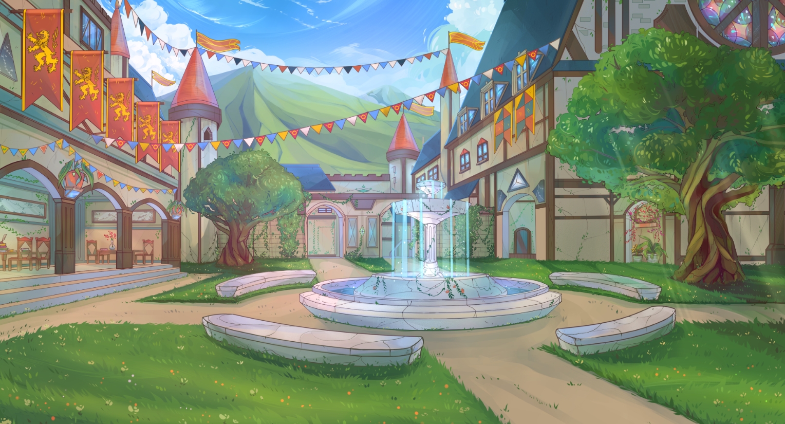
Old courtyard looked like this:

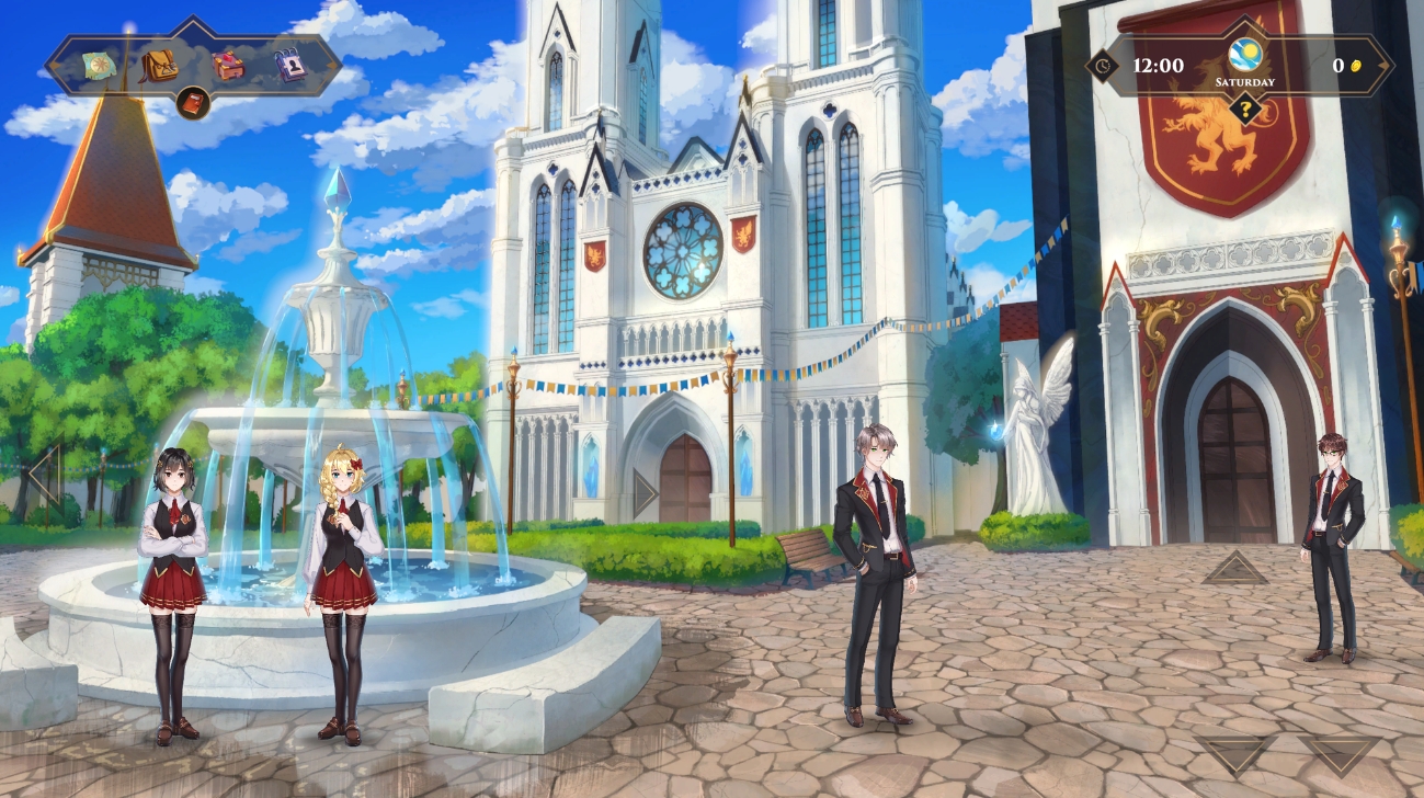
Old fountain, flatter picture and no animation. But we still love that background. Also, there was a stone in this courtyard with names of patrons of the Academy - does anyone want their name on that yet? In 0.4.0, it looked more alive and spacious - we've added animations! So now there’s water pouring from the fountain, clouds floating, flags fluttering and birds flying. Also now you can see the Auditorium and the Dinning Hall in the background. Visually it became clearer what the Courtyard of the Academy looks like and what buildings are located in this area. Amazing!

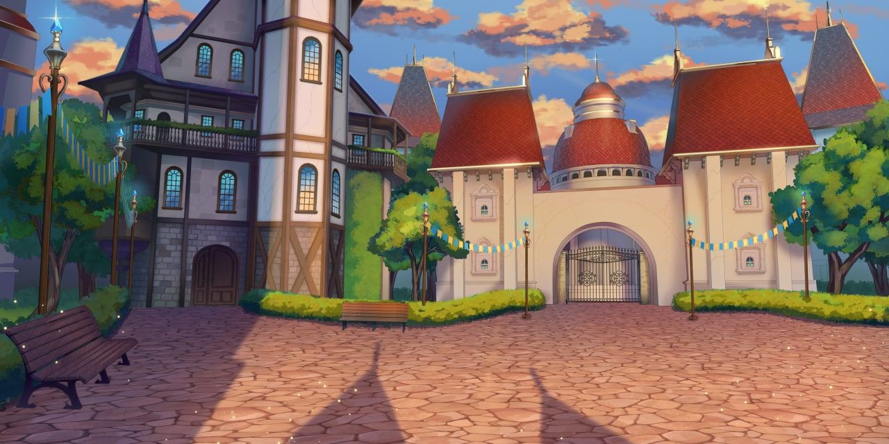
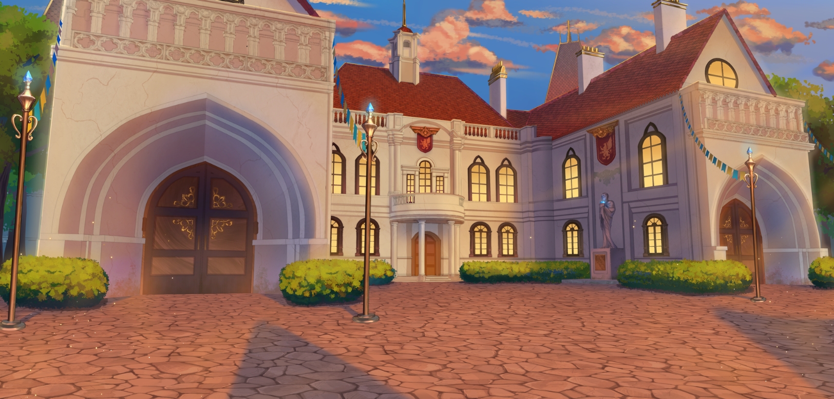
But in 0.4.3, we’re going to expand the courtyard to three distinct backgrounds, all from the same point of view!
Infirmary and baths’ background looks like this:


In 0.4.3, you can see where each location is. It's easier to understand playing the game with more visual markers rather than buttons with text. Share your wisdom in the comments - do you like our new backgrounds?
Get WANDERER: Broken Bed | v0.9 - CHRISMAS GIFT (OLD VERSION)
WANDERER: Broken Bed | v0.9 - CHRISMAS GIFT (OLD VERSION)
Adventure with RPG elements
| Status | In development |
| Author | TOPHOUSE |
| Genre | Adventure, Visual Novel |
| Tags | 2D, Adult, Anime, Dating Sim, Erotic, Hentai, NSFW, Romance, Singleplayer |
| Languages | English, Russian |
| Accessibility | Subtitles |
More posts
- RELEASE - NEW Build v0.12 WitchCraft 🔮56 days ago
- Awaken: Hentai Dice DEMO - We'll see it on Steam very soon 🔥66 days ago
- Lyndaria: Lust Adventure - RELEASE ON STEAM 👙84 days ago
- Special Artbook Pack - 5 games at once - Check out our Patreon!88 days ago
- WANDERER REMASTERED - SPECIAL FREE BUILD v0.11.777 - A Fresh Look90 days ago
- Join our Telegram channel 💖94 days ago
- Check out the New Build of our friends! Umbranomicon v1.1.097 days ago
- AURA: Horny Madness IS NOW ON STEAM + Patch v1.6 with Raccoon-Trader 😱 💥...99 days ago
- Devlog WANDERER “Witchcraft”🔮Sep 04, 2024

Comments
Log in with itch.io to leave a comment.
cool, will special potion quest be fixed?
Of course there will be bug fixes.
nice, that's the only thing i'm stuck on